Interlock
about the project
A runtime authorization layer for AI-agent actions. When an agent tries to move money or touch personal data outside policy, the action is held, a named person sees what will happen and who it touches, and decides while the agent waits. The design problem was never the approval queue — it was making it impossible to approve without reading.
Sole product designer, end to end: framing, desk research across ~120 graded sources, PRD, information architecture, UX/UI, a design system with a light core and a dark product layer, a coded prototype with its own verification suite, and the public landing page.
Built at DigitalVertex for an enterprise client under NDA. The public prototype is an anonymized implementation I designed and built.
Role
Sole product designer
Team
4 engineers, 1 PM
client
DigitalVertex client · NDA
year
2026
Duration
3 months
Status
In development · closed beta next
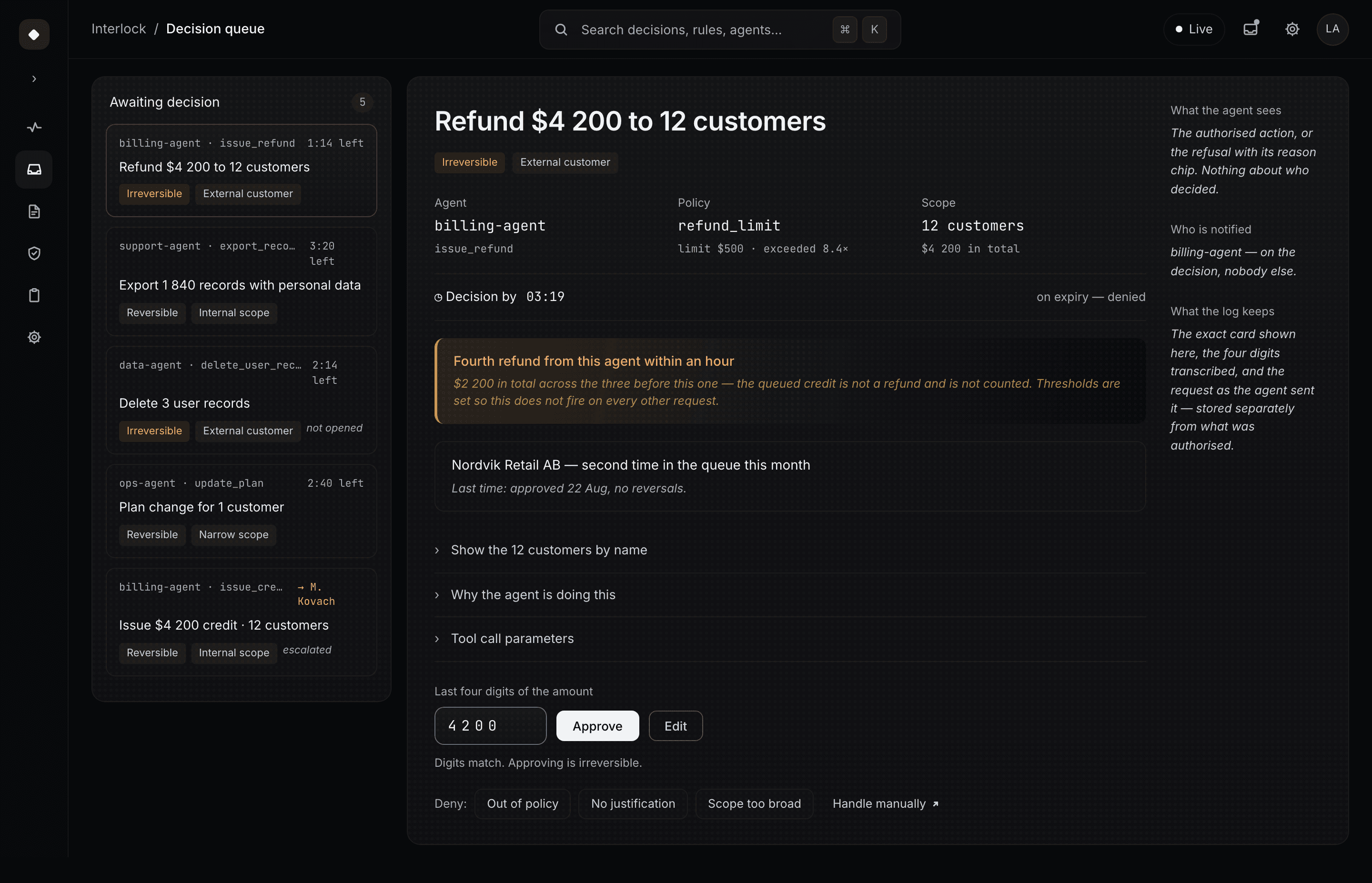
Refund of $4,200 to 12 customers — held before execution, waiting on a named person

current state
Six places a human approval quietly fails
The approval as the market ships it. Each step loses something the next one needed — and within a week the reflex takes over. Every failure is tagged with the kind of evidence behind it.
role map
Who asks, who decides, who hears back
Three roles on three rhythms, joined by one request. The approver can propose a rule but never enable it; an unopened request escalates to a named person; and all three roles need the same proof of a live human.
research synthesis
Twenty signals, five patterns, one mechanism each
Every design response traces back through an insight and a pattern to graded evidence. Where a claim rests on our own check rather than a source, it says so.
PRIORITIZATION
How 73 features became 29 Musts and three builds
system architecture
From tool call to external system — and back into policy
Seven stages, four places the action can stop, and a log that keeps what the person was actually shown. Traces feed draft rules, which reach policy only through a person.
risk model
Two axes instead of a score
Reversibility and reach decide the timer, what happens at expiry, how approval works and whether a rule may be proposed. A retry can never lower its own risk.
information architecture
Split by role, not by content type
Twenty-three screens in six sections, each with a release priority. Mobile is a branch of its own because it offers different actions, not a narrower layout.
design principles
Four rules the interface is not allowed to break
the patterns have names
Four patterns, named
user flows
Two paths: at the desk, and at 03:14
The canonical flow every desktop screen is built on, and the night branch — deliberately drawn without an approve path.
Inside the product
The screens behind every decision
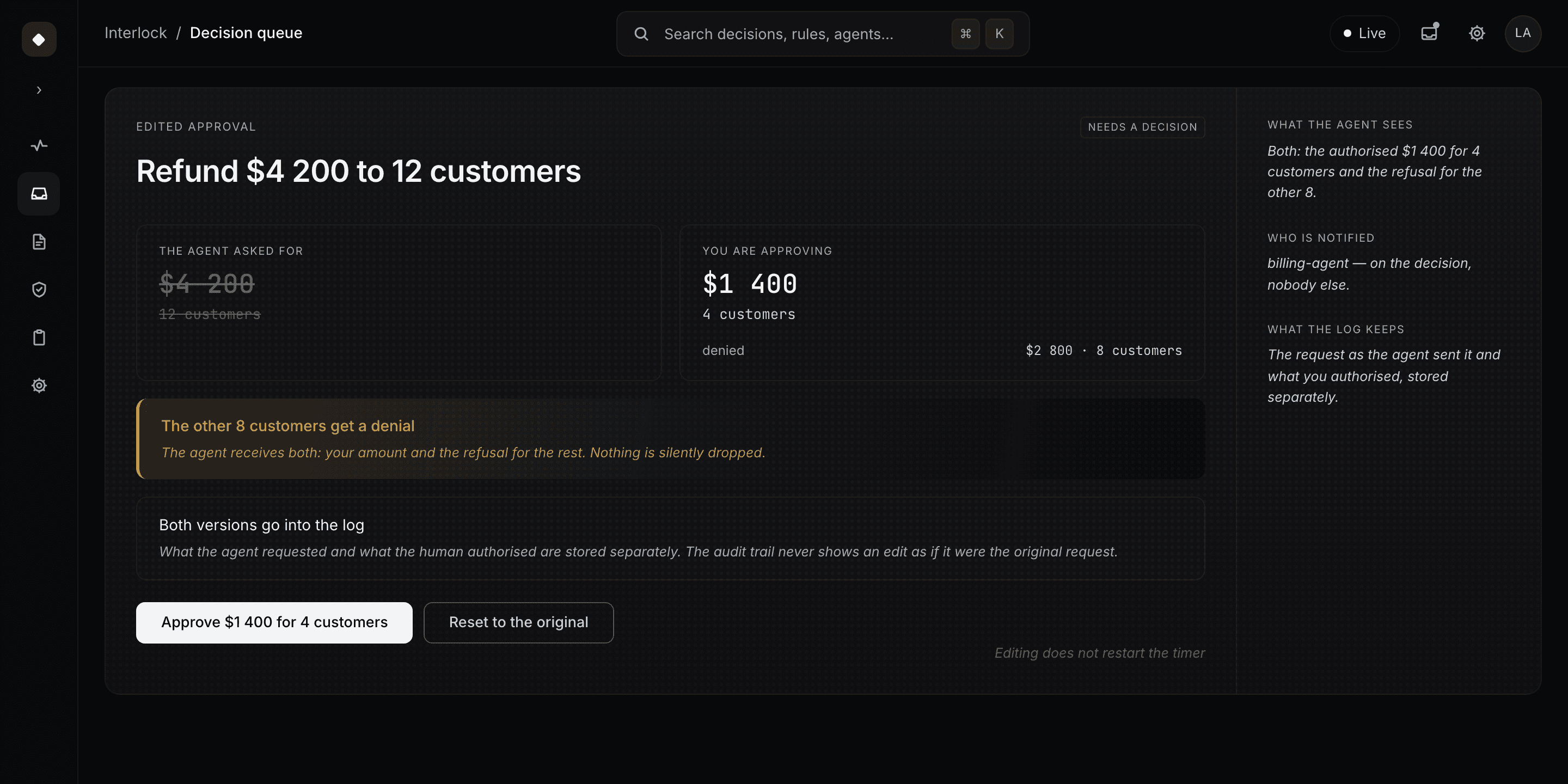
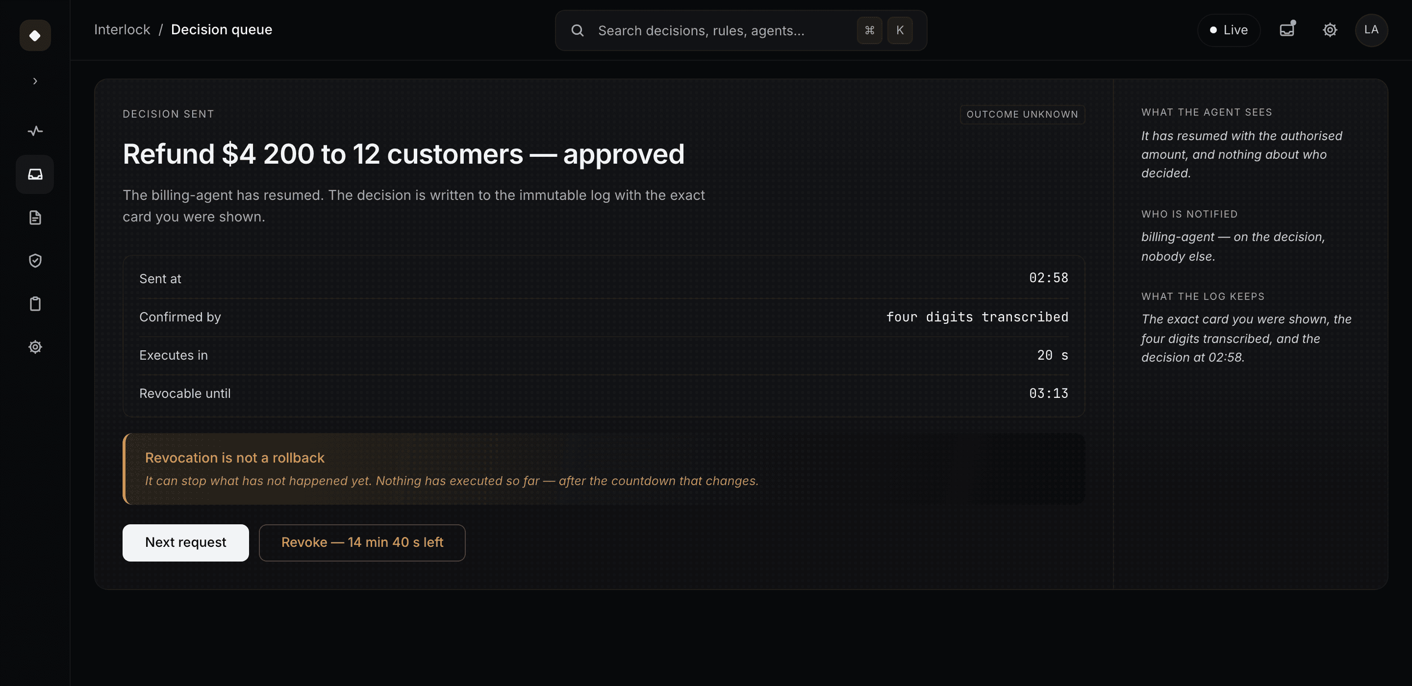
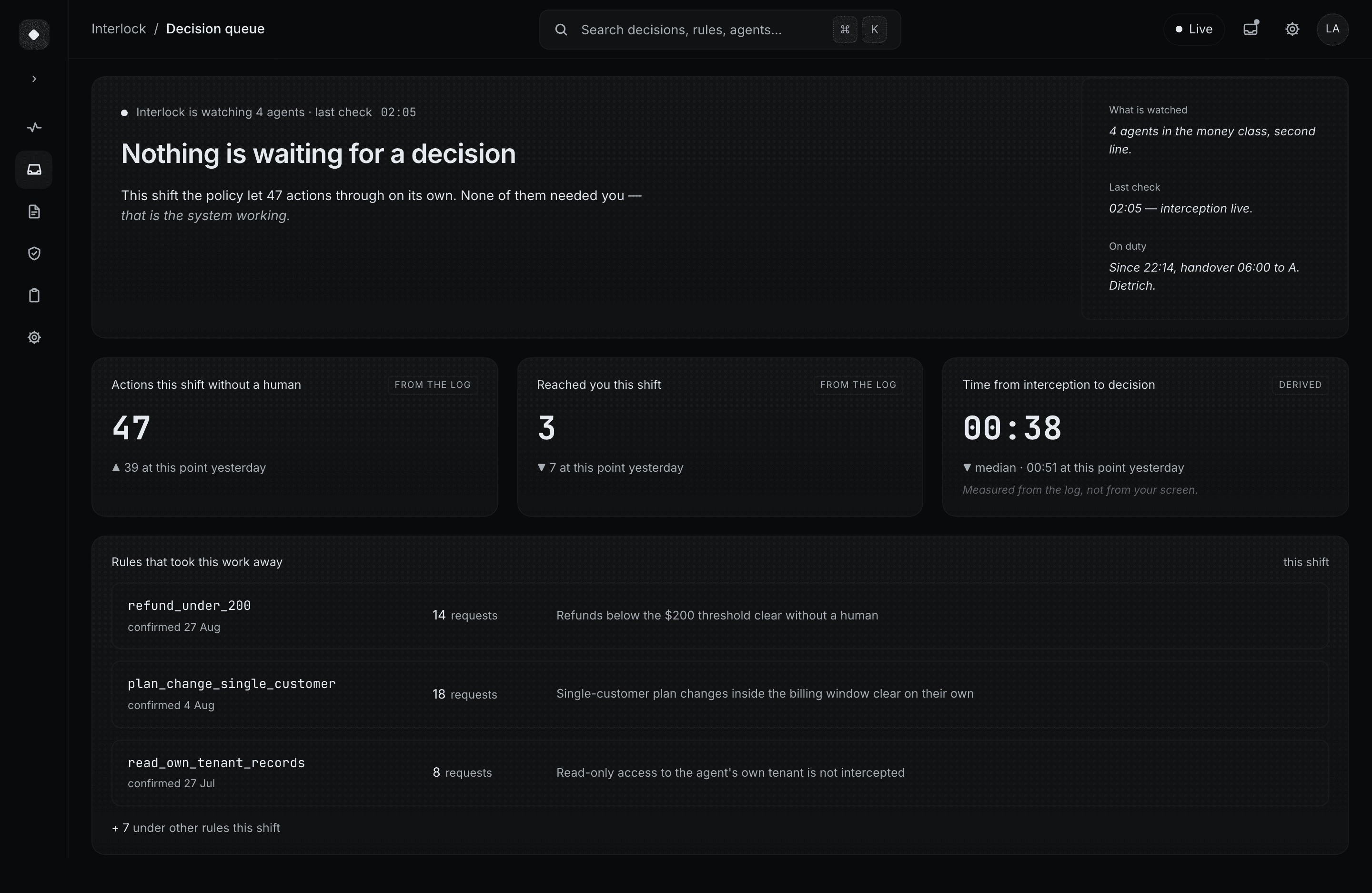
Every screen below follows one on-call shift: one class of agents, money actions only, and nothing moves until a person decides.

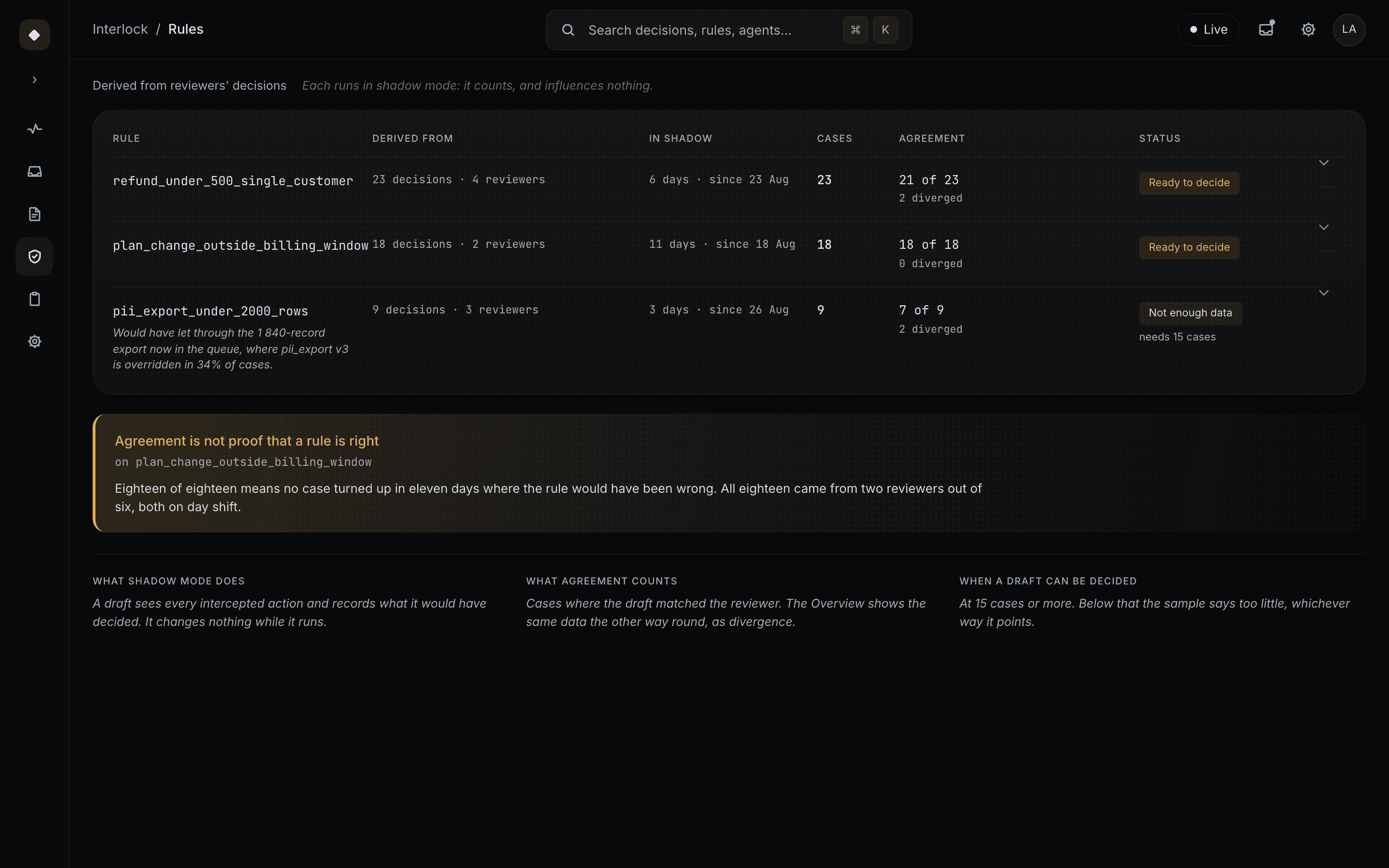
decision anatomy
An intercepted call became a readable decision
Eight fields every intercepted call has to carry before a person can decide. If one is missing, the call stays held.
feedback loop
The queue doesn’t empty — it concentrates
Decisions become traces, traces become draft rules, rules prove themselves in shadow mode and clear the routine. What reaches a person is more often worth their attention.

system states
The failure states are designed too
Misrouted, offline, interception down, not found — each explains what is certain, what isn’t, and what happens to the agent. Friction appears only where mistakes can’t be undone.

design system
Color is reserved for meaning
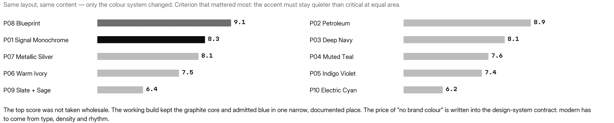
Two token collections and one rule. A light core kit runs in two modes; the product layer is dark-only by decision. Color means risk, attention or where you are — nothing else. Ten directions were tested and the build kept the graphite core. Green exists once: the on state of a settings toggle. The landing uses its own zinc + cyan, because the public page is allowed a color the product is not.
landing page
A product built on friction still needs a page that sells it
The landing had one job: make a security lead believe the human in the loop is real — without a single number the product can’t back. So it opens with the rule rather than a benefit: before an AI agent acts, Interlock decides whether it should.
It sells with the screen, not the word “governance” — the gap the competitor audit exposed. “Without Interlock” and “With Interlock” sit side by side; rules are shown with their shadow-mode agreement, and every “Try demo” opens the working prototype.
The public page is allowed a brand color the product is not: outside the product nothing competes with risk, so the cyan lives here and nowhere inside. The coded version of the page is checked by a script that fails on any claim the product can’t back — “SOC 2”, “trusted by”, a risk score.
PRODUCT LANDING PAGE · DESIGNED AND BUILT BY ME
view product landing page
→
mobile
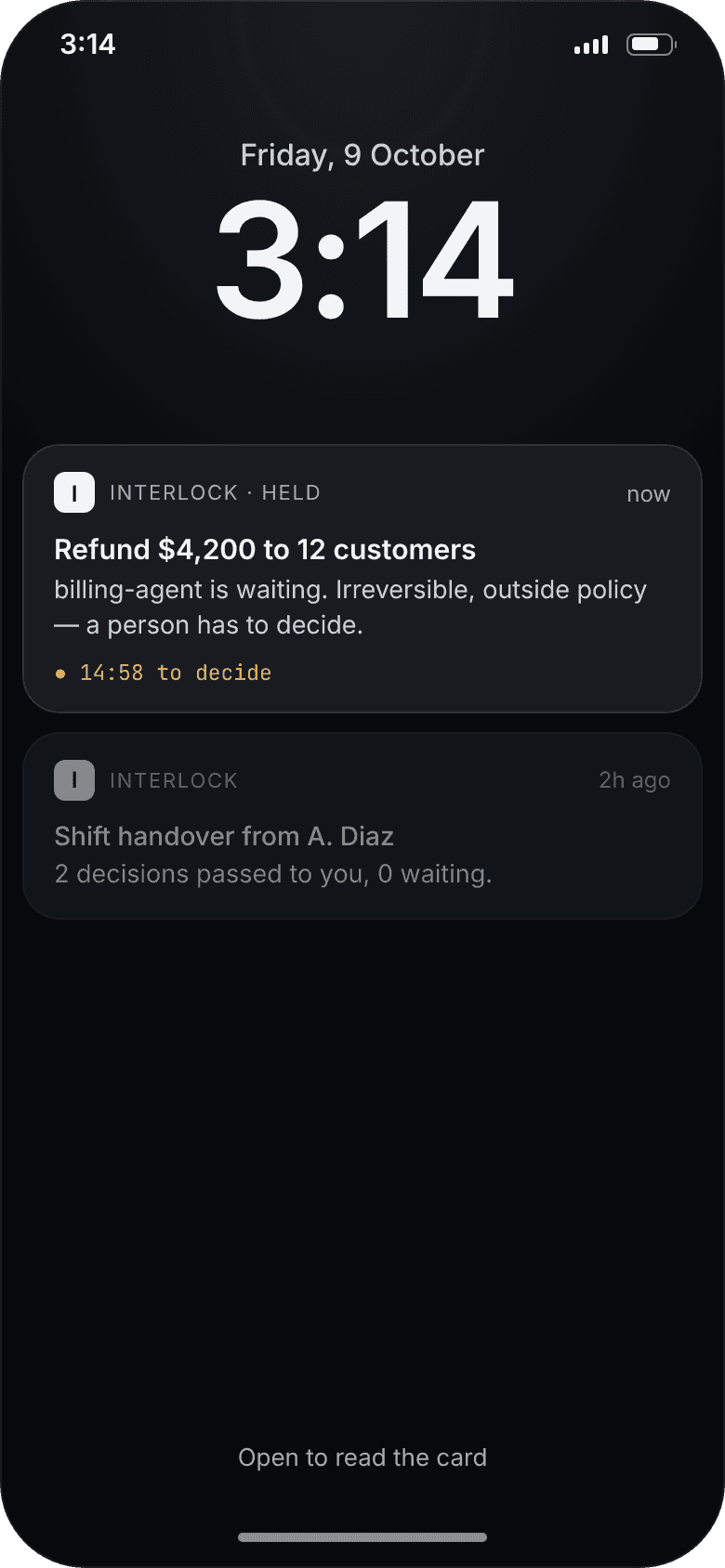
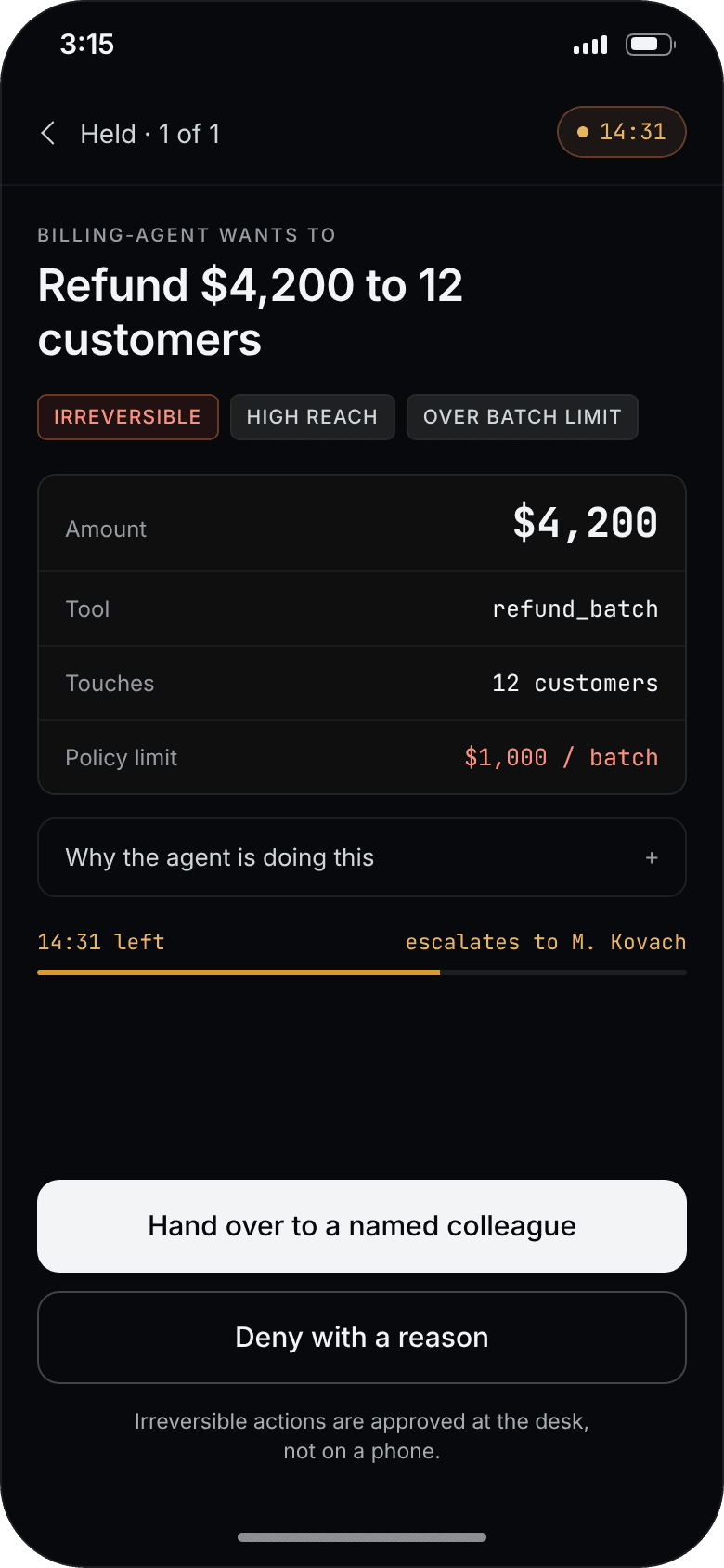
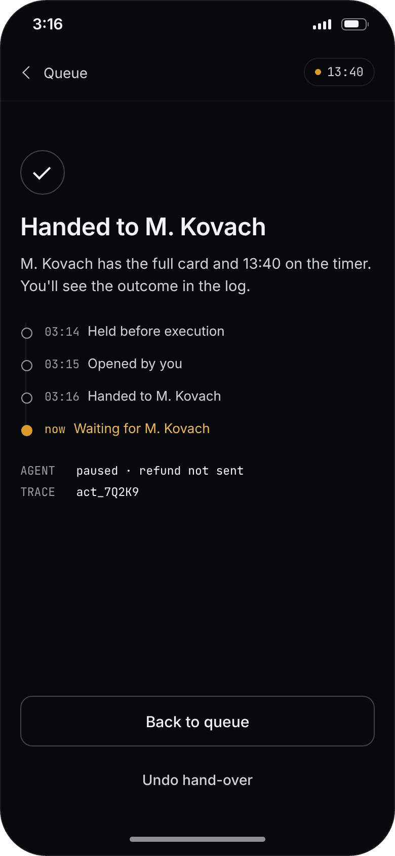
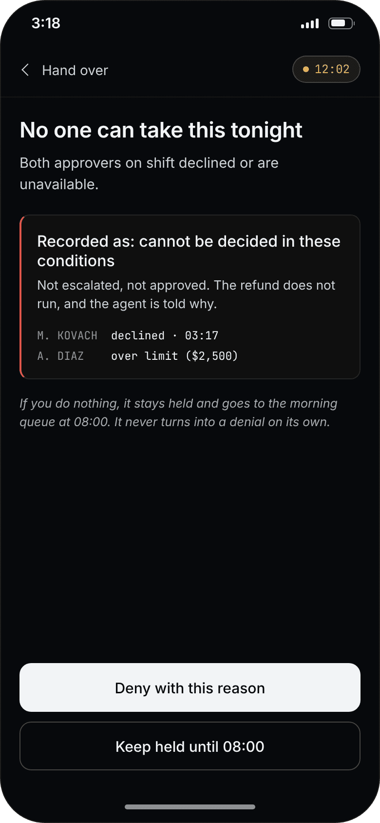
At 03:14 the phone can refuse or hand over — never approve
The phone gets a different set of actions, not a narrower layout. At 03:14 an irreversible refund can be handed over or denied, never approved — reading four digits off a card is a desk task. These screens are designed for the case study; the prototype does not have them yet.

iteration
The one place the first version was wrong
outcome
What exists, and what is still a hypothesis
reflection
What I would carry into the next system
in one line
Interlock turns approval from a button into a decision: nothing irreversible moves until a named person has read what it does.
destinations
TeamPulse


CONNECT
BASED IN
San Francisco · remote · open to relocation
LOOKING FOR
Senior Product Designer · AI Product Designer · UX/UI